
The Future of Conscious Creation: Why Storytelling is the Key to Sustainable Fashion Success
The Future of Conscious Creation: Why Storytelling is the Key to Sustainable Fashion Success
The fashion industry is currently undergoing a massive transformation that goes far beyond simple aesthetic trends. Today, the modern consumer is no longer satisfied with just looking good; they want to feel good about what they wear and understand the impact of their purchases on the world. This shift toward “conscious creation” has forced brands to rethink how they communicate their values and mission. For many emerging labels and established houses alike, the secret to navigating this new landscape lies in the power of narrative. Working with a dedicated creative partner like Regal Fierce Media has become essential for brands that want to translate their sustainable practices into compelling stories that resonate with a global audience. By focusing on the “why” behind every stitch, brands can build a loyal community that values ethics as much as elegance.
Conscious creation is more than a buzzword; it is a commitment to intentionality in design, production, and marketing. At PHVLO, we have always believed that fashion should serve a purpose, blending functionality with a deep respect for the creative industries. However, even the most innovative sustainable products can get lost in the noise of a crowded digital marketplace if they lack a strong voice. Storytelling bridges the gap between a product’s technical specifications and the consumer’s emotional needs. It turns a recycled polyester jacket from a piece of outerwear into a symbol of environmental stewardship and urban utility. Without this narrative thread, the true value of sustainable fashion remains hidden from those who are looking for it most.
The Shift from Mindless Consumption to Meaningful Connection
For decades, the fashion industry thrived on a model of fast-paced consumption where the goal was to sell as much as possible as quickly as possible. This “fast fashion” era prioritized volume over value, leading to significant environmental and social consequences. However, the tide is turning. Consumers are becoming increasingly aware of the lifecycle of their garments, and they are looking for brands that offer transparency and longevity. This shift represents a move from mindless buying to meaningful connection. People want to know the hands that made their clothes and the philosophy of the designers who dreamt them up.
This is where storytelling becomes a competitive advantage. When a brand shares the journey of its materials—from organic cotton fields to the final sewing floor—it creates a sense of intimacy with the wearer. This connection fosters brand loyalty that transcends price points. Instead of competing on cost, conscious brands compete on character. By highlighting the human element of production, fashion labels can humanize their operations and build trust. In an age of skepticism, authenticity is the most valuable currency a brand can hold, and storytelling is the most effective way to spend it.
Furthermore, storytelling allows brands to educate their audience without sounding preachy. Instead of listing dry facts about carbon footprints, a brand can tell a story about a specific initiative that reduced waste or supported a local craft community. This narrative approach makes complex sustainability topics accessible and engaging. It invites the consumer to be part of a larger movement, making their purchase feel like an investment in a better future rather than just another transaction. This emotional investment is what keeps customers coming back season after season.
Transparency as the New Standard of Luxury
In the past, luxury was defined by exclusivity, high price tags, and glossy logos. Today, the definition of luxury is evolving to include transparency and ethical integrity. A truly luxury item is now one that is made with care, respects the environment, and is built to last. For brands like PHVLO, which focus on functional and sustainable designs, showing the “behind-the-scenes” process is vital. Transparency is no longer an optional add-on; it is a requirement for any brand that claims to be “conscious.” Storytelling provides the framework for this transparency, allowing brands to be open about their successes and their challenges.
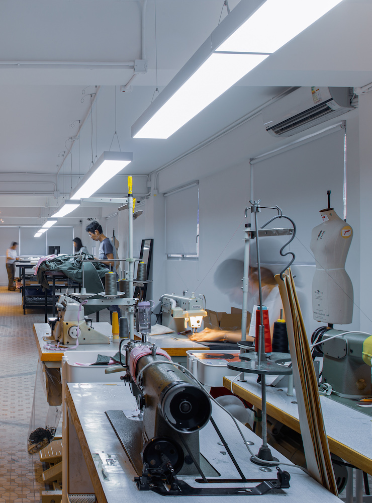
When a brand is honest about its supply chain, it builds a foundation of credibility. Storytelling helps to break down the complexities of sustainable manufacturing into digestible pieces of content. For example, a video series showing the development of a new eco-friendly fabric can be far more impactful than a simple label on a garment. It shows the research, the trial and error, and the passion that goes into creating a sustainable product. This level of detail validates the price point of high-quality goods and justifies why conscious creation is worth the extra effort and cost.
Moreover, transparency through storytelling helps to combat “greenwashing.” As more brands jump on the sustainability bandwagon, consumers are becoming more adept at spotting shallow marketing claims. To stand out, brands must provide depth. By documenting their journey and sharing real data through engaging narratives, they prove that their commitment to the planet is genuine. This honest communication builds a resilient brand reputation that can withstand the scrutiny of the modern digital age. It transforms the brand from a nameless corporation into a living, breathing entity with a clear moral compass.
Bridging the Gap Between Function and Fashion
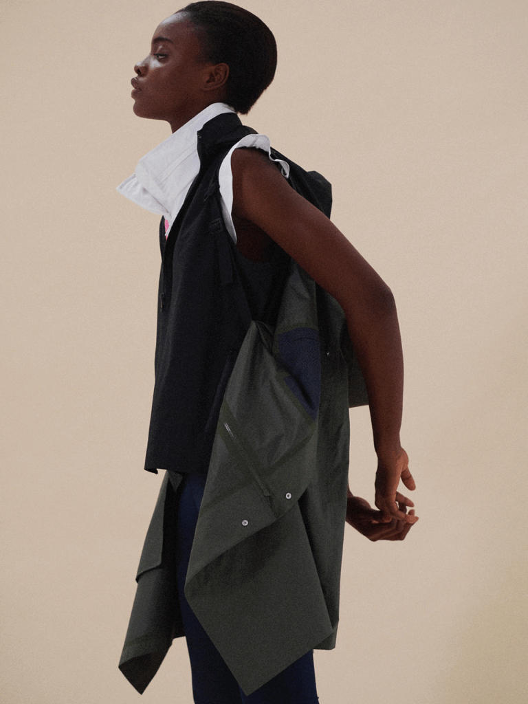
One of the biggest challenges in the sustainable fashion space is the misconception that “eco-friendly” means “unfashionable” or “basic.” Many consumers still associate sustainable clothing with drab colors and simple silhouettes. At PHVLO, we aim to shatter this myth by creating pieces that are both highly functional and aesthetically striking. Storytelling is the key to changing this perception. It allows us to showcase how technical innovation can coexist with high-end design. By telling the story of how a garment transitions from a professional environment to a creative workshop, we highlight the versatility that modern life demands.
Effective storytelling highlights the “performance” aspect of conscious creation. It’s not just about the fabric being recycled; it’s about how that fabric breathes, moves, and protects the wearer. Through visual storytelling—such as high-quality photography and dynamic video—brands can demonstrate the utility of their designs in real-world scenarios. This helps the consumer visualize how the piece fits into their own busy life. When people see that they don’t have to sacrifice style for sustainability, they are much more likely to make the switch to conscious brands.
This intersection of function and fashion is where creativity truly shines. Storytelling allows designers to explain the “why” behind specific features, such as hidden pockets, weather-resistant coatings, or modular components. These details often go unnoticed on a rack, but through a well-crafted narrative, they become selling points. It turns the garment into a tool for the creative professional, designed to support their lifestyle. By focusing on the utility of the design, brands can appeal to a broader audience that values practicality as much as ethics.
Digital Content: The Lifeblood of Sustainable Success
In today’s interconnected world, a brand’s digital presence is often the first point of contact with a potential customer. For sustainable brands, this means that their online content must be as high-quality as their physical products. Whether it is through social media, email newsletters, or long-form blog posts, the narrative must be consistent and compelling. This is where professional media strategy becomes indispensable. If you are looking to refine your brand’s voice or create stunning visual content that tells your unique story, the team at Regal Fierce Media offers the expertise needed to help you shine in a competitive digital landscape.
Digital storytelling is not just about posting pretty pictures; it is about creating a cohesive brand universe. Every piece of content should contribute to the larger story of the brand’s mission. For instance, a sustainable brand might use Instagram Stories to show a “day in the life” of their warehouse or use a YouTube series to interview the artisans they work with. This variety of content keeps the audience engaged and provides multiple touchpoints for them to connect with the brand’s values. It builds a community of followers who are not just customers, but advocates for the brand’s vision.
Additionally, digital platforms allow for two-way communication. Storytelling becomes a conversation when brands encourage their audience to share their own experiences. This user-generated content is a powerful form of storytelling that adds another layer of authenticity to the brand. When customers post photos of themselves wearing a brand’s clothes in their daily lives, they are telling their own story of conscious consumption. Brands that facilitate this interaction create a loyal tribe of supporters who feel seen and heard. In the digital age, the most successful brands are those that listen as much as they speak.
Community Initiatives and the Power of Shared Values
Sustainable fashion is inherently linked to community. It is about recognizing that we are all part of a larger ecosystem and that our choices affect others. Many conscious brands, including PHVLO, place a heavy emphasis on community initiatives and supporting the creative industries. Storytelling is the tool that brings these initiatives to life. By sharing the stories of the people and projects they support, brands can demonstrate their commitment to social responsibility. This goes beyond charity; it is about building sustainable partnerships that benefit everyone involved.
When a brand tells the story of a community project, it invites its audience to participate in something bigger than themselves. Whether it is a workshop for aspiring designers or a local environmental cleanup, these stories show that the brand is an active participant in the world. This builds a deep sense of trust and respect. Consumers are increasingly looking for brands that align with their personal values, and community-focused storytelling is the best way to signal those values. It transforms the brand from a seller of goods into a leader of a movement.
Furthermore, these initiatives provide a wealth of content that is naturally engaging and inspiring. People love to see positive impact in action. By highlighting the success stories of their community partners, brands can create a “feel-good” factor that is incredibly powerful for marketing. It creates a virtuous cycle where the brand’s success leads to more community support, which in turn leads to more compelling stories and more loyal customers. This holistic approach to business is the hallmark of the future of conscious creation.
Measuring Impact Beyond the Sale
In the world of conscious creation, success is measured by more than just profit margins. While financial viability is essential, brands also look at their environmental and social impact. Storytelling helps to quantify and communicate this impact in a way that is meaningful to the consumer. Instead of just reporting that they saved a certain amount of water, a brand can tell the story of the specific ecosystem that was protected. This makes the impact feel real and tangible. It gives the consumer a sense of pride in their purchase, knowing that they contributed to a positive outcome.
Long-term brand equity is built through consistent, honest storytelling. When a brand stays true to its narrative over many years, it develops a legacy. This legacy is what allows a brand to weather economic downturns or changes in fashion trends. A brand with a strong story is resilient because its value is not tied solely to its products, but to its identity and its relationship with its community. This is the ultimate goal of conscious creation: to build a brand that lasts and continues to make a difference for generations to come.
Finally, measuring impact involves looking at the growth of the movement itself. As more brands adopt storytelling and transparency, the entire industry is pushed to do better. Conscious creation is a collective effort, and every brand that tells its story contributes to a larger narrative of change. By sharing their journey, brands inspire others to follow suit, creating a ripple effect that can transform the entire global fashion system. This is the true power of storytelling: it doesn’t just sell clothes; it changes minds and shapes the future.
Conclusion: Crafting Your Narrative for a Sustainable Future
The future of fashion is undeniably conscious. As we move forward, the brands that thrive will be those that understand that their story is just as important as their product. Storytelling is the bridge that connects sustainable practices with consumer desires, turning functional garments into meaningful symbols of change. By embracing transparency, highlighting technical innovation, and fostering community, brands can create a lasting impact that goes far beyond the runway. It is an exciting time for creators who are ready to lead with their values and share their vision with the world.
If you are a creator, designer, or business owner ready to take your brand to the next level, don’t leave your narrative to chance. The digital world requires a strategic and fierce approach to media and marketing. We highly recommend reaching out to the experts at Regal Fierce Media to help you craft a story that truly resonates. Their team understands the nuances of modern brand building and can help you communicate your commitment to conscious creation in a way that drives success and builds a loyal community. Visit them today and start building the future of your brand.